Are you curious about how to bring calm, light, and simplicity into your home? Scandinavian interior colors hold the secret.
These hues don’t just decorate a space—they create a feeling of warmth and balance you’ll want to experience every day. Imagine walking into a room that instantly makes you feel relaxed and refreshed. Want to know which colors can transform your space like that?
Keep reading, and discover the perfect palette to make your home both stylish and inviting.

Key Colors In Scandinavian Interiors
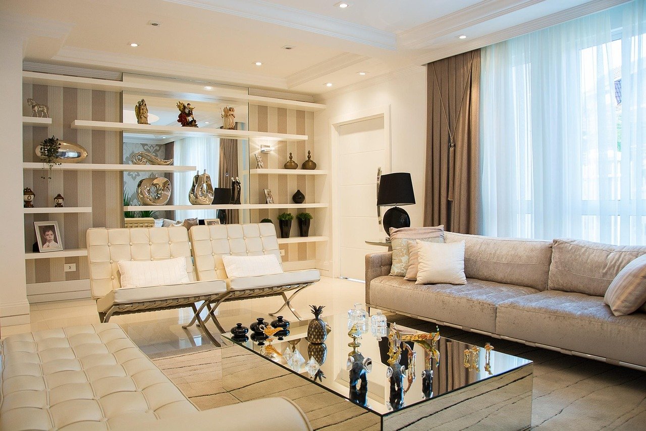
Scandinavian interior design uses colors that create calm and warmth. The palette is simple but effective. It helps to brighten spaces and make them feel welcoming. Understanding these key colors can help you bring a Scandinavian touch to your home.
Neutral Base Tones
White is the most common base color in Scandinavian interiors. It reflects light and opens up rooms. Soft grays and beiges also create a quiet, clean background. These neutral tones make spaces look fresh and airy. They allow furniture and decor to stand out without overwhelming the eye.
Soft Pastel Accents
Light blues, gentle pinks, and pale greens add subtle color. These pastels bring a gentle feel to the room. They do not compete with the neutral base but add a soft touch. Pastel accents can appear in cushions, rugs, or wall art. They help create a cozy and relaxed atmosphere.
Bold Dark Contrasts
Black or deep navy colors offer strong contrast in Scandinavian design. These dark tones highlight shapes and details. They are used in small amounts, such as picture frames or furniture legs. The contrast adds depth and interest without making the room feel heavy. It keeps the design balanced and modern.
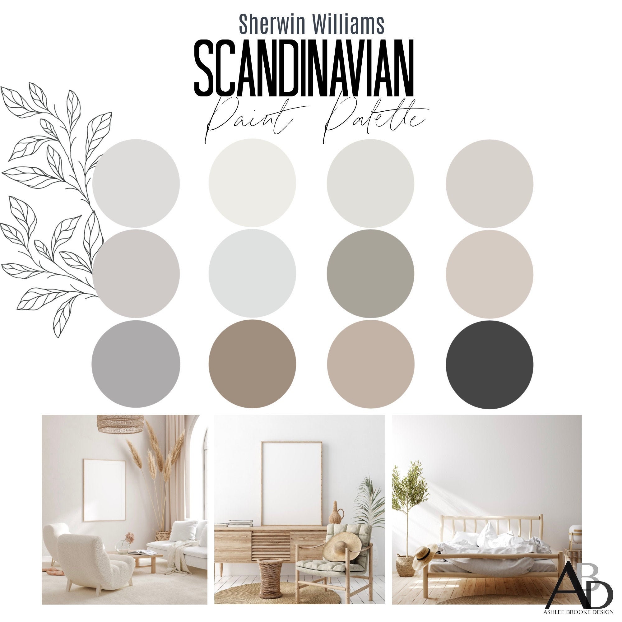
White And Its Variations
White plays a key role in Scandinavian interior design. It creates a sense of space and calm. Various shades of white add depth and warmth. These variations prevent the room from feeling cold or empty. White acts as a perfect base for natural light and simple furnishings. It helps balance the overall look with other colors and textures.
Pure White For Brightness
Pure white is the classic choice for Scandinavian homes. It reflects light well and makes rooms appear larger. Walls painted in pure white feel fresh and clean. This shade works well with wood and metal details. It enhances natural light, making spaces feel airy and open. Pure white fits every room, from kitchens to bedrooms.
Cream And Off-white Shades
Cream and off-white tones add softness to interiors. These shades bring warmth without overpowering the space. They create a cozy, inviting atmosphere. Cream works well with natural wood and soft textiles. Off-white offers a subtle contrast to pure white walls. These tones keep the room bright but less stark.
Popular Pastel Hues
Popular pastel hues bring soft charm to Scandinavian interiors. These colors create a calm and inviting space. They balance the bright whites and natural wood tones commonly found in Scandinavian design. Pastel shades add warmth and subtle color without overwhelming the room.
Muted Blues And Greens
Muted blues and greens reflect nature’s calmness. Soft blue tones remind of the clear Nordic skies. Gentle greens evoke forests and moss-covered stones. These colors promote relaxation and peace. They work well on walls, cushions, and decor pieces. Muted blues and greens pair nicely with light wood furniture. They keep the space airy and fresh.
Blush Pink And Soft Coral
Blush pink and soft coral add delicate warmth. These hues bring a subtle glow to the room. They soften sharp edges and create a cozy feel. Blush pink fits well with neutral palettes and white accents. Soft coral introduces a gentle, lively touch. These colors often appear in textiles and artwork. They enhance the Scandinavian style with a quiet elegance.
Earthy And Natural Shades
Earthy and natural shades form the heart of Scandinavian interior design. These colors bring warmth and calm to any space. They create a cozy, inviting atmosphere that feels close to nature. Using these tones helps balance light and space in Scandinavian homes. The palette draws from the earth, forests, and soft natural elements. It offers a simple yet rich color scheme for interiors.
Warm Browns And Beiges
Warm browns and beiges add depth and comfort to rooms. These colors mimic the look of wood, soil, and sand. They pair well with natural materials like leather and wool. Browns and beiges create a grounded feel that soothes the eyes. They also work perfectly as background colors for other bold accents. These shades bring a timeless, organic touch to Scandinavian homes.
Greys Inspired By Nature
Greys in Scandinavian design are soft and natural, not cold. They reflect stones, pebbles, and foggy skies. These greys blend well with whites and muted pastels. They offer a modern yet cozy look to interiors. Nature-inspired greys help create calm and quiet spaces. They balance brighter colors and add subtle elegance.
Using Black And Dark Colors
Black and dark colors play a key role in Scandinavian interior design. They bring a strong and bold touch to soft, light spaces. These colors add character and depth without overwhelming the room. Using black and dark shades creates a modern and cozy feel.
Creating Contrast And Depth
Dark colors create a sharp contrast with pale walls and furniture. This contrast makes spaces feel more dynamic and alive. Black accents like frames, lamps, or furniture legs draw the eye and add interest. Dark tones also add depth, making rooms feel layered and rich. This technique breaks the monotony of all-white spaces.
Balancing With Light Elements
Balancing dark colors with light elements keeps the space open and fresh. White walls, light wood, and soft textiles soften the heaviness of black. This balance maintains the airy Scandinavian look. It also prevents rooms from feeling too dark or small. The mix creates harmony and a welcoming atmosphere.

Color Combinations To Try
Scandinavian interiors are known for their calm and inviting feel. The right color combinations can make a space feel bright and cozy. Choosing colors carefully helps create balance and harmony in the room. Here are some color combinations to try that fit the Scandinavian style perfectly.
Monochromatic Schemes
Monochromatic schemes use different shades of one color. This approach brings simplicity and elegance to any room. For example, soft grays with white create a peaceful, clean look. Light blues with darker blues add depth without clutter. These schemes keep the space calm and easy on the eyes.
Complementary And Analogous Palettes
Complementary palettes use colors opposite each other on the color wheel. Think soft blue paired with warm orange. This contrast adds energy while staying balanced. Analogous palettes use colors next to each other, like green and blue. This creates a smooth, natural flow. Both palettes highlight the Scandinavian love for nature and simplicity.
Impact Of Lighting On Colors
Lighting plays a big role in how colors look in Scandinavian interiors. The right light can make colors feel fresh, bright, and warm. It changes how we see shades and tones throughout the day and night. Understanding lighting helps you choose colors that feel cozy and inviting.
Natural Light Effects
Natural light is soft and changes with the time of day. Morning light feels cool and blue, making whites and blues look crisp. Afternoon light is warmer and yellow, giving beige and soft pinks a gentle glow. Large windows and light curtains help bring in more daylight. This makes rooms feel open and airy. Natural light highlights the simple, clean colors typical in Scandinavian design.
Artificial Lighting Choices
Artificial lights add warmth and comfort after sunset. Warm white bulbs work best to keep the cozy feeling. Soft yellow tones make wood and neutral colors stand out. Avoid harsh, cold lights that can make rooms look dull. Floor lamps, pendant lights, and candles add layers of light. They create a calm and welcoming atmosphere in the space.
Textiles And Accessories Colors
Textiles and accessories bring life to Scandinavian interiors. They add warmth and texture without overwhelming the space. These elements balance the neutral colors often found in furniture and walls. Choosing the right colors for fabrics and small decor items can create a cozy and inviting atmosphere. Let’s explore how colors play a role in these textiles and accessories.
Soft Fabrics And Color Choices
Scandinavian design favors soft fabrics like wool, linen, and cotton. These materials feel comfortable and natural. Their colors are usually calm and muted. Shades like pale gray, soft beige, and gentle white are common. These light colors keep the space bright and airy. Sometimes, soft pastels like blush pink or light blue appear. They add subtle color without losing the calm vibe.
Textiles in these colors help create a peaceful mood. They blend well with wood tones and simple furniture. Soft colors also make the room feel larger and cleaner. Cozy throws, cushions, and curtains often use these gentle hues. They invite relaxation and comfort in any room.
Accent Pieces For Color Pops
Small accessories often bring brighter colors into Scandinavian interiors. These accents break the neutral palette in a balanced way. Items like pillows, rugs, or vases introduce pops of color. Deep blues, rich greens, or warm mustard yellows work well. These shades add interest and personality to the space.
Accent colors highlight the room’s style without overpowering it. They create focal points and draw the eye. These pops of color also reflect nature, a key part of Scandinavian design. Using accessories this way keeps the room fresh and lively. It’s an easy way to update a look without big changes.
Seasonal Color Adjustments
Seasonal color adjustments play a big role in Scandinavian interior design. These changes help keep rooms feeling fresh and cozy all year. The palette shifts to match the natural light and weather outside. This approach connects indoor spaces to the seasons. It makes homes more inviting and comfortable.
Warmer Tones For Winter
Winter calls for warm, rich colors to fight the cold. Shades like deep reds, burnt oranges, and warm browns add comfort. They create a snug atmosphere that feels safe and calm. These colors pair well with natural wood and soft textiles. Using warmer tones brightens dark winter days inside the home.
Lighter Shades For Summer
Summer invites light, airy colors to reflect the bright days. Soft whites, pale blues, and gentle greens work well. These shades make rooms feel open and cool. They echo the clear skies and fresh greenery outdoors. Lighter colors help keep interiors fresh and relaxed during warm months.
How Home DecorUp Can Help You with What are the Colors in Scandinavian Interior
Practical Ways to Explore Scandinavian Colors in Your Space
Understanding the key colors in Scandinavian interiors opens up many opportunities to experiment thoughtfully in your home. Start by focusing on white and its variations, which create that signature bright, airy feeling. Pairing these with earthy and natural shades, such as soft browns and muted greens, brings warmth and balance without overwhelming the senses.
Consider how lighting influences these colors throughout the day. Natural light can enhance pastels and whites, while carefully placed textiles and accessories add subtle pops of color and texture. Try layering fabrics in light grays or soft blues to deepen the room’s character without sacrificing simplicity.
- Test color combinations in small areas first
- Observe the effect of daylight and artificial lighting
- Mix textures to complement your chosen palette
For more insights and practical tips on Scandinavian color use, resources like Home DecorUp offer helpful guides and inspiration. They provide clear, human-centered advice suitable for anyone looking to bring this style to life. Feel free to reach out to them via their website for tailored suggestions that suit your unique space.
Frequently Asked Questions
What Are The Primary Colors In Scandinavian Interior Design?
Scandinavian interiors mainly use white, light gray, and soft beige. These colors create a bright, airy, and calming atmosphere. They reflect natural light, enhancing room spaciousness and simplicity.
How Do Natural Tones Influence Scandinavian Interior Colors?
Natural tones like wood brown and muted greens add warmth and texture. They connect interiors with nature, promoting comfort and balance. These tones complement the minimalist color palette perfectly.
Why Is White Dominant In Scandinavian Interiors?
White maximizes natural light in often dark Nordic climates. It creates a clean, fresh look and serves as a neutral backdrop. This allows other design elements and textures to stand out.
Can Scandinavian Interiors Include Bold Colors?
Yes, bold colors like deep blue or mustard are used as accents. They add personality and contrast without overpowering the space. Accent pieces like cushions or artwork often feature these shades.
Conclusion
Scandinavian interior colors bring calm and light to any space. Soft whites, grays, and blues create a peaceful feel. Natural wood tones add warmth and comfort. Pops of muted pastels keep the look fresh and inviting. This color palette fits simple, clean designs well.
It helps rooms feel bright and open all year. Choose these colors to make your home cozy and stylish. A gentle, soothing atmosphere awaits with Scandinavian hues. Simple yet elegant. Perfect for everyday living.