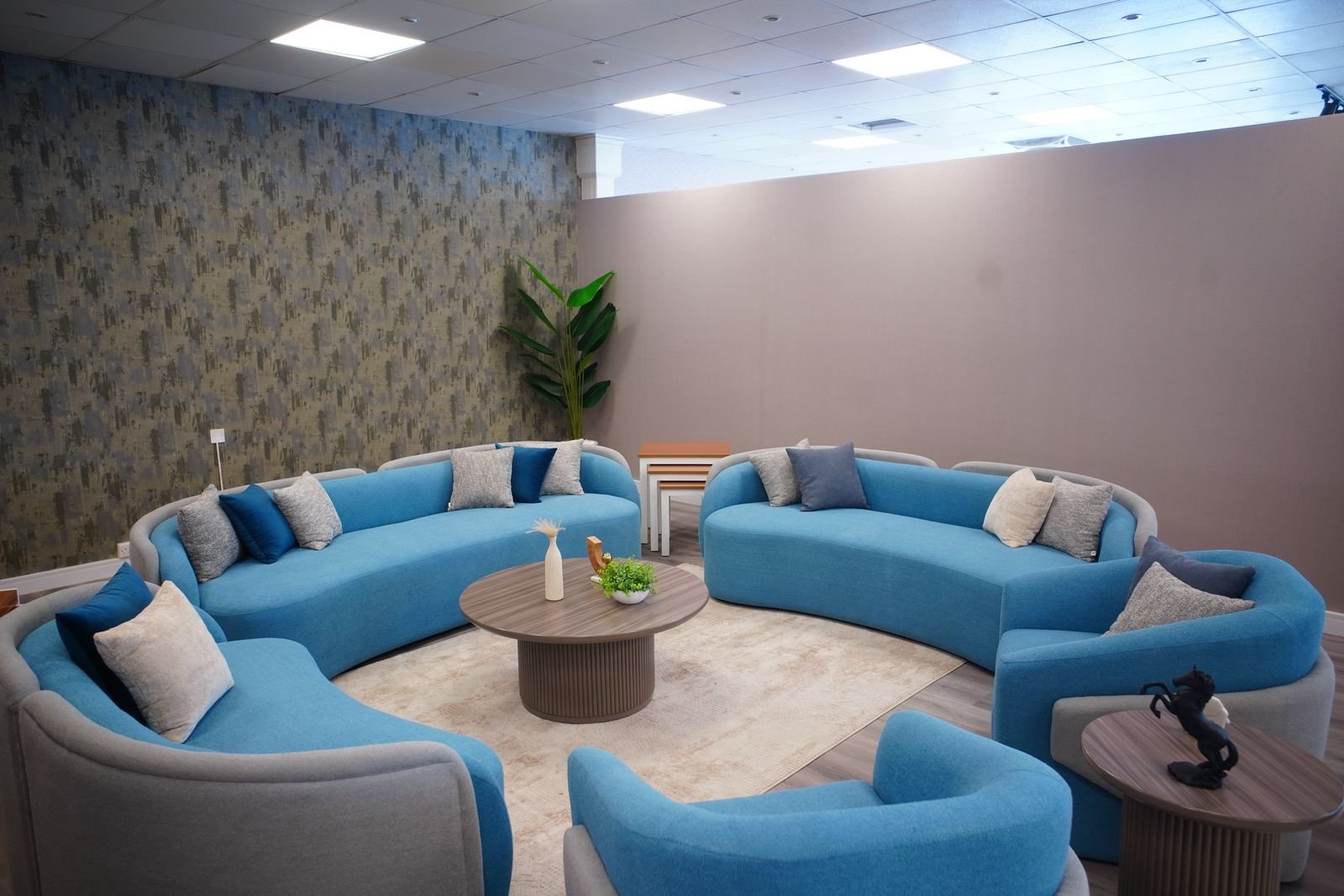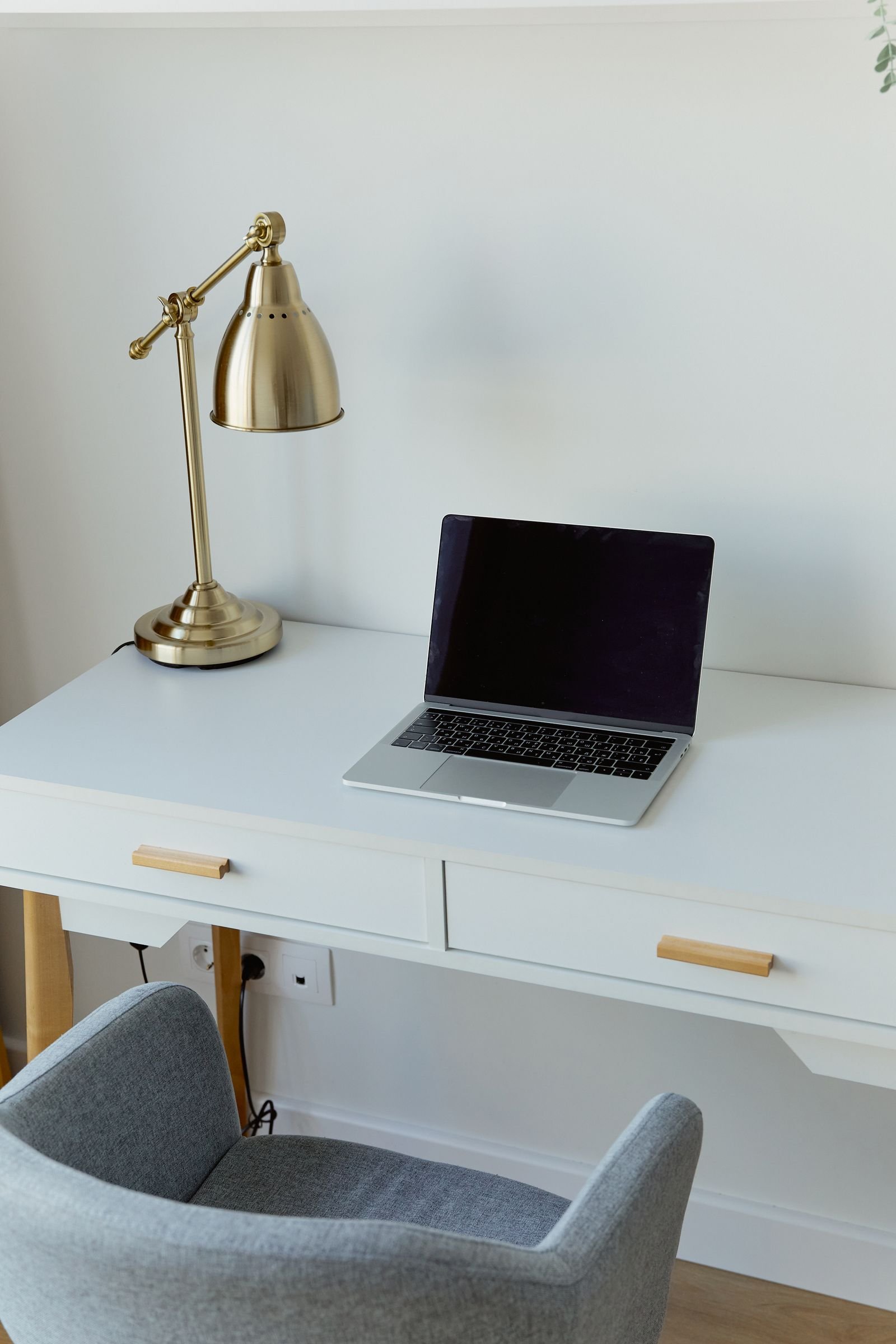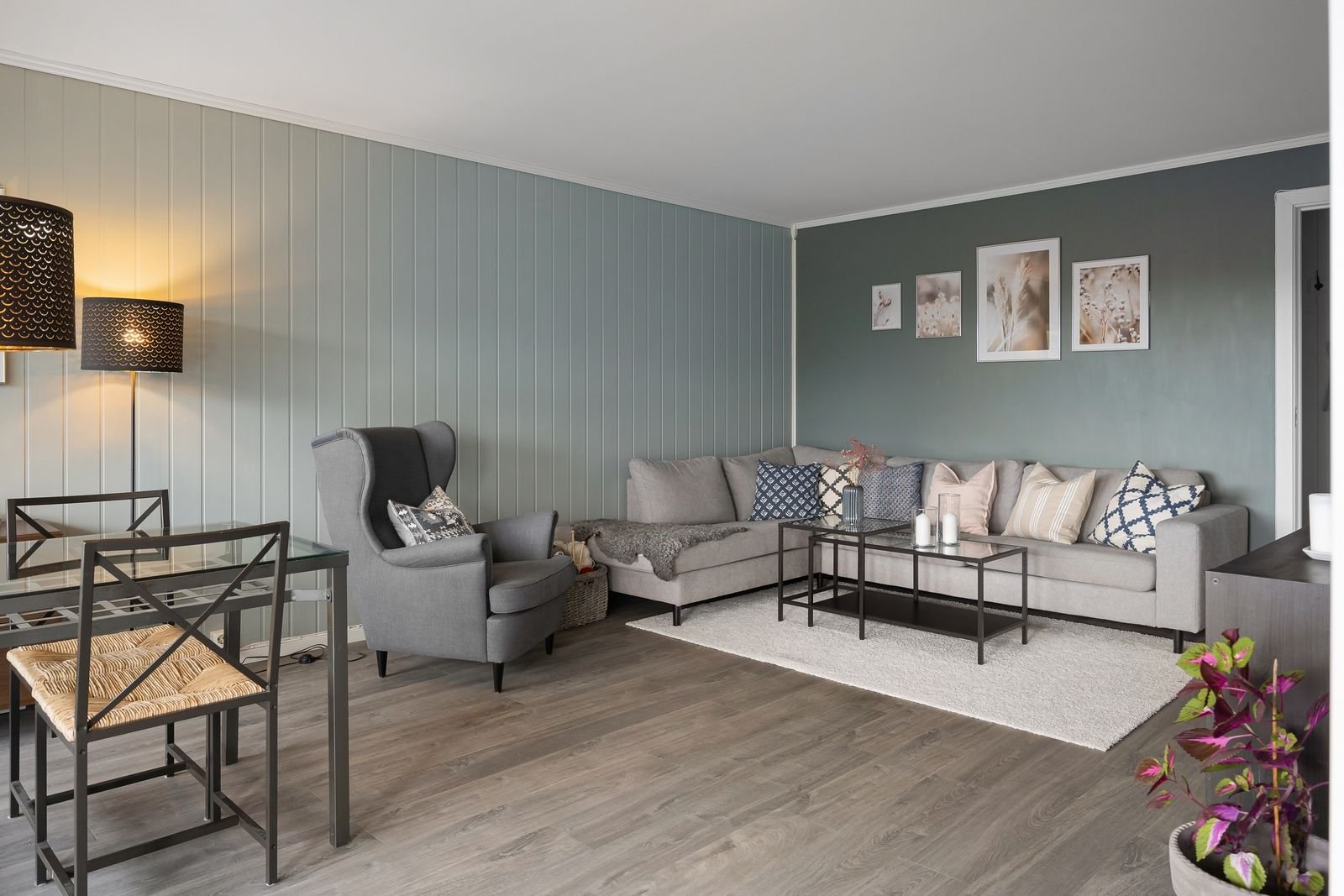
A monochromatic room uses one color in many shades, tints and tones. It sounds simple, and it is, but it is also one of the easiest ways to make a home look calm, put together and stylish.
This guide gives eight reasons to try the look, followed by a short, practical plan for building a monochromatic room yourself. It works with blue, green, gray, beige or any color you love.
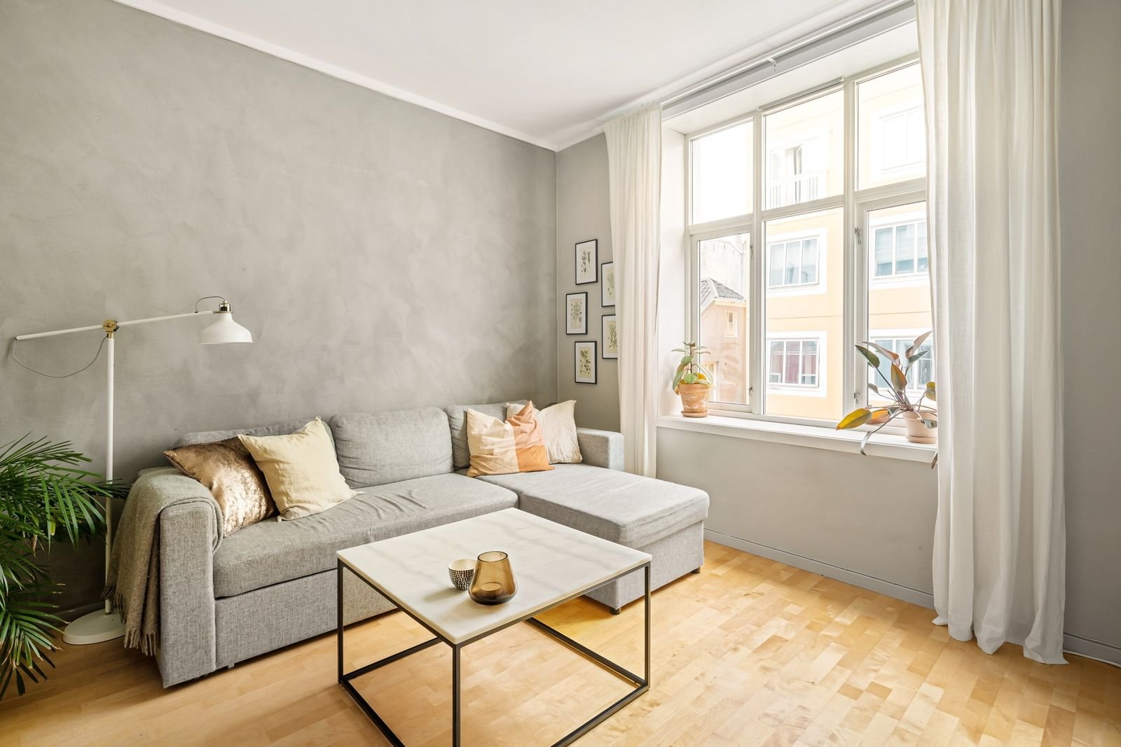
Simplicity in Design
A single color family removes a lot of noise. The eye rests on shapes, textures and light instead of jumping from one color to the next.
Minimalist Aesthetic
Monochromatic design suits minimalist style. With fewer colors to manage, the room feels smooth, sleek and uncluttered. Each piece can stand out through its form and finish instead of competing in color. The result is a room that feels open and airy.
Easy Color Coordination
When everything comes from one color family, matching is simple. Different shades blend naturally, and you do not need to guess what works with what. Mix light and dark tones for contrast. This approach suits beginners and experienced decorators alike.
Creates Visual Harmony
Shades of one color look connected, so the room feels unified and welcoming.
Balanced Color Scheme
Using one color in several tones avoids clashing combinations. The scheme feels steady and well planned, and there is a natural flow between the walls, furniture and accessories.
Soothing Effect
Seeing one color throughout a space is restful for the eye. There are no sharp color changes, so the room often feels quieter and more relaxed. This makes the look popular for bedrooms and reading corners.
Enhances Space Perception
Color changes how big a room feels. Shades of a single color reduce the visual breaks that make a space look smaller.
Makes Rooms Appear Larger
When walls, floors and furniture share a color family, the eye travels freely across the room. Light shades add brightness and airiness, and darker tones add depth without crowding the space. Painting the trim and the walls in the same color is a quick way to make a small room look bigger.
Unifies Disparate Elements
Most homes mix furniture from different times and styles. A shared color theme ties those pieces together and hides mismatches. The room tells one clear story instead of several.
Timeless and Elegant
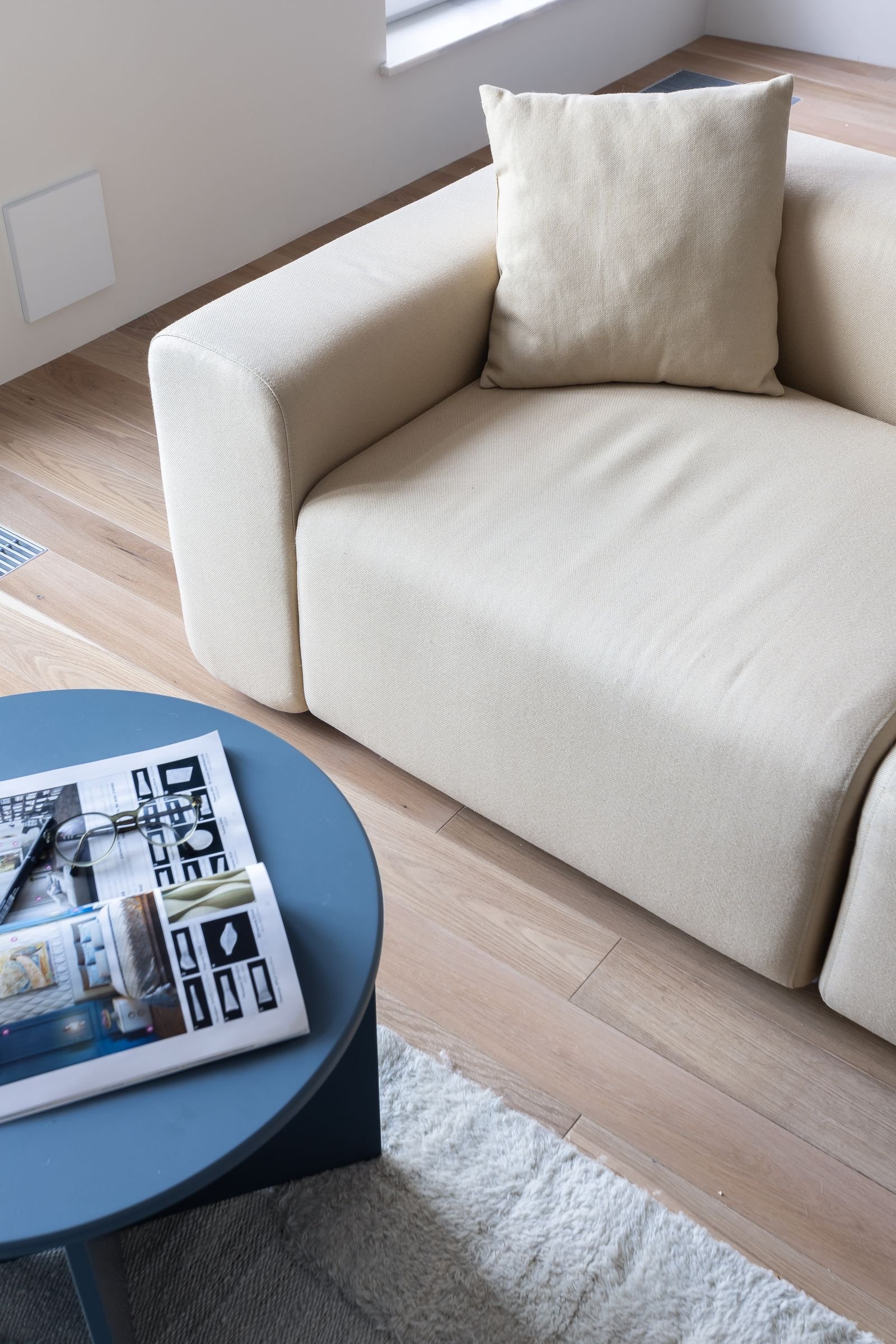
A monochromatic room avoids loud contrasts and busy patterns, so it rarely looks dated.
Classic Appeal
One color with many tones creates depth in a natural, quiet way. The style suits houses, apartments and offices, and it can look sophisticated in almost any shade.
Avoids Trendy Pitfalls
Trends come and go. A palette built on one color is less tied to a particular moment, so you can update it with new accessories instead of redoing the whole room. For current color ideas, see our guide to home decor color trends.
Flexibility With Accents
The calm base makes it easy to change the mood with small additions.
Easy to Add Contrast
A bright pillow, a dark vase or a bold piece of art stands out against a single-color room. You can also use darker or lighter shades of the same color for subtle contrast. Add one or two accent colors only if you want to.
Works With Various Textures
Because color is limited, texture matters more. Smooth, rough, soft and shiny surfaces create layers. Try velvet, linen, wool, wood, metal and glass in the same color family so the room does not look flat.
Streamlines Decorating Choices
Having fewer color decisions makes decorating faster and less stressful.
Simplifies Furniture Selection
When you do not have to match several colors, you can focus on comfort, size and shape. It is easier to find pieces that work together, and shopping takes less time.
Reduces Decision Fatigue
A single color scheme gives you a clear filter for every purchase. You either keep it in the family or you leave it. That keeps the process calm, and the room looks cohesive when you finish.
Highlights Architectural Features
With color kept quiet, the structure of the room takes center stage.
Focus on Shape and Form
Moldings, arches, windows and ceiling lines become more noticeable when they share a color with the walls. Shadows and light add interest to flat surfaces.
Enhances Natural Light
Light shades reflect daylight and brighten the room. A pale monochrome room can feel airy even when it faces north, and natural light shows off the textures and materials.
How to Build a Monochromatic Room
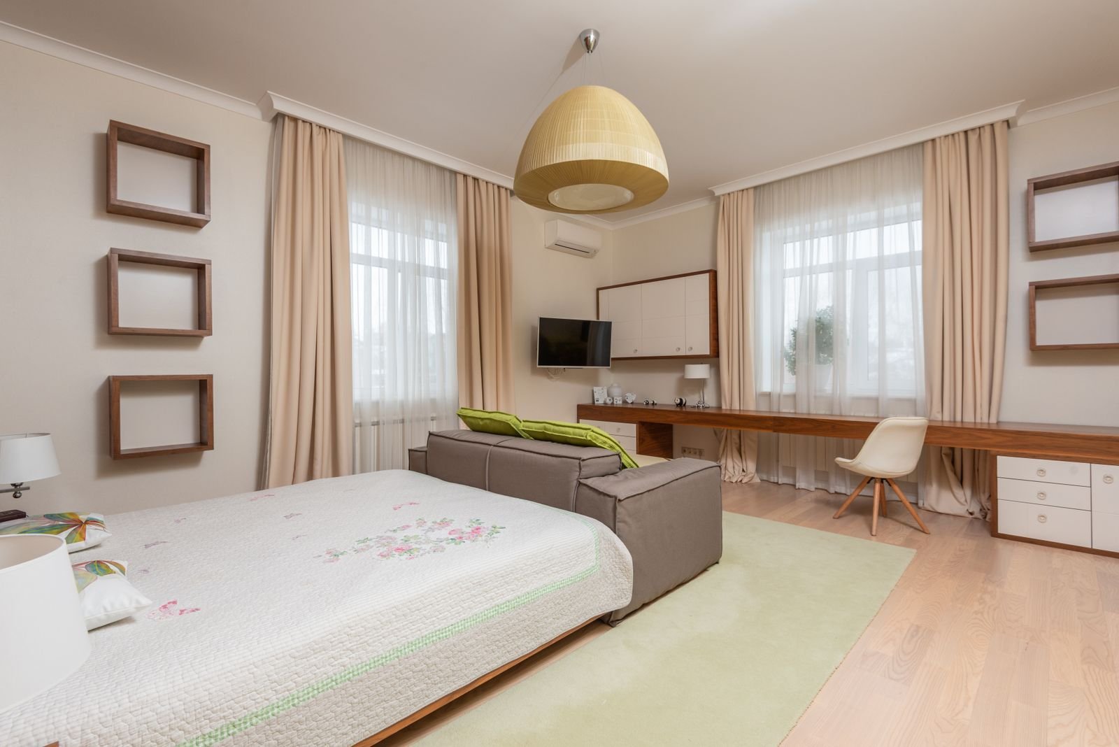
These steps turn the idea into a plan you can follow, one room at a time.
Pick One Color and Three Shades
Choose a color you enjoy living with. Then pick a light, a medium and a dark shade of it. A common approach is to use the lightest shade on the walls, the medium shade on large furniture and the darkest shade for accents. Our guide to blue and black decor shows how deep tones can work in a room.
Layer Texture and Finish
Mix matte and glossy surfaces. Add wool, linen, velvet and wood. A woven basket, a ceramic vase and a metal lamp in the same color family add interest without adding new colors.
Add a Neutral or Metallic Touch
A little white, black, wood or metal gives the eye a place to rest. Gold, brass or black frames suit many palettes. Our black and white decor ideas offer more inspiration for neutral schemes.
Check the Light
Shades look different in the morning, in the evening and under lamps. Paint a large sample and view it at several times of day before you commit. Use warm bulbs to soften cool colors and cooler bulbs to freshen warm ones.
Frequently Asked Questions
What Is a Monochromatic Design in Simple Terms?
It is a design that uses different shades, tints and tones of one color. It creates a clean, balanced and calm look.
Can a Monochromatic Design Work in Any Room?
Yes. It works in almost any room, from living rooms to bedrooms to offices. Using one color can make rooms feel larger and more cohesive.
Will a Monochromatic Room Feel Boring?
Not if you vary the shades and textures. Mixing light and dark tones, matte and shiny finishes and different materials keeps the room interesting.
Is a Monochromatic Design Cost-Effective?
It can be, because you only need to match one color family and can reuse existing pieces by adding a few new accessories. Costs depend on what you buy.
Which Color Is Best for a Monochromatic Room?
Any color can work. Blue, green, gray and beige are popular because they are easy to layer. Choose a color you enjoy and that suits the light in your room.
Conclusion
A monochromatic design brings calm and balance to a home. It simplifies decisions, helps rooms feel larger and lets architecture and texture shine. Pick one color, layer several shades and textures, and add a few accents. The result is a room that feels clean, stylish and easy to live with.