Color trends change, but the best ones share a few things. They feel natural, they work with the light in your home, and they are easy to live with. This guide covers the palettes, accent colors and pairings that are popular in home decor now, plus how to use them room by room.
You do not need to repaint the whole house. A few cushions, a rug or a single painted wall can bring a new color into your home. Start small, test your choices in your own light, and build from there. For more on what is current, see our guide to top home decor trends.
Emerging Color Palettes
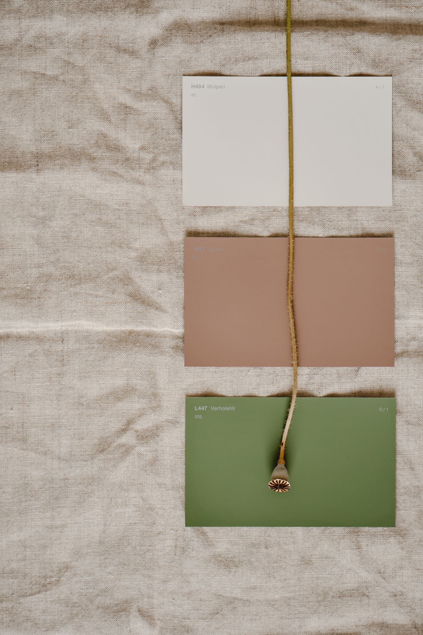
Three palette families are shaping home decor now. Each has its own mood, and each pairs well with natural materials such as wood, stone, linen and wool.
Warm Earth Tones
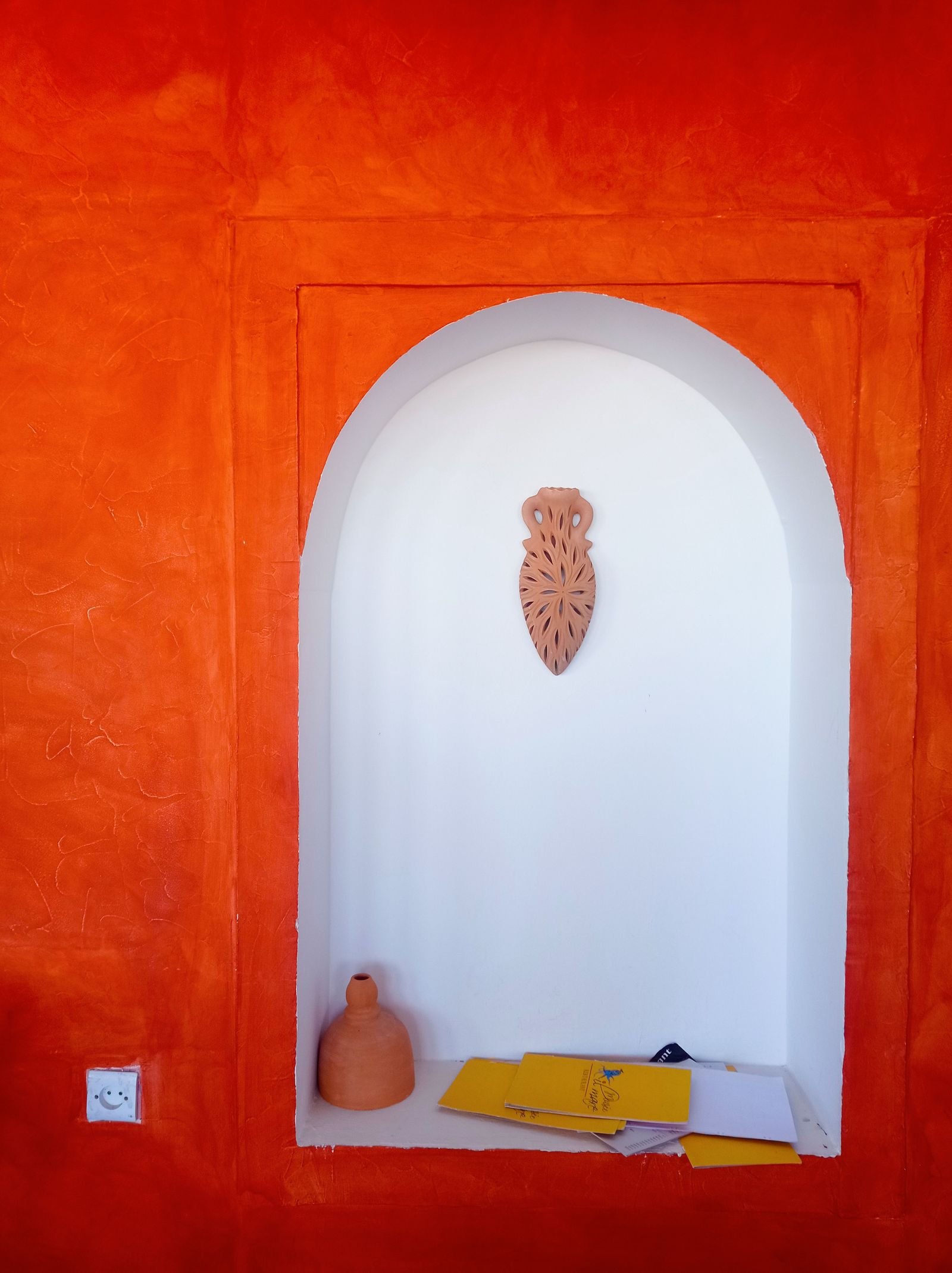
Terracotta, clay, sand and warm beige create a cozy, grounded feel. They look especially good with wood and stone, and they suit living rooms and bedrooms. Add a few earthy shades to a neutral room and it will immediately feel warmer. Earthy neutrals such as taupe and soft brown also work well as a base.
Bold Jewel Shades
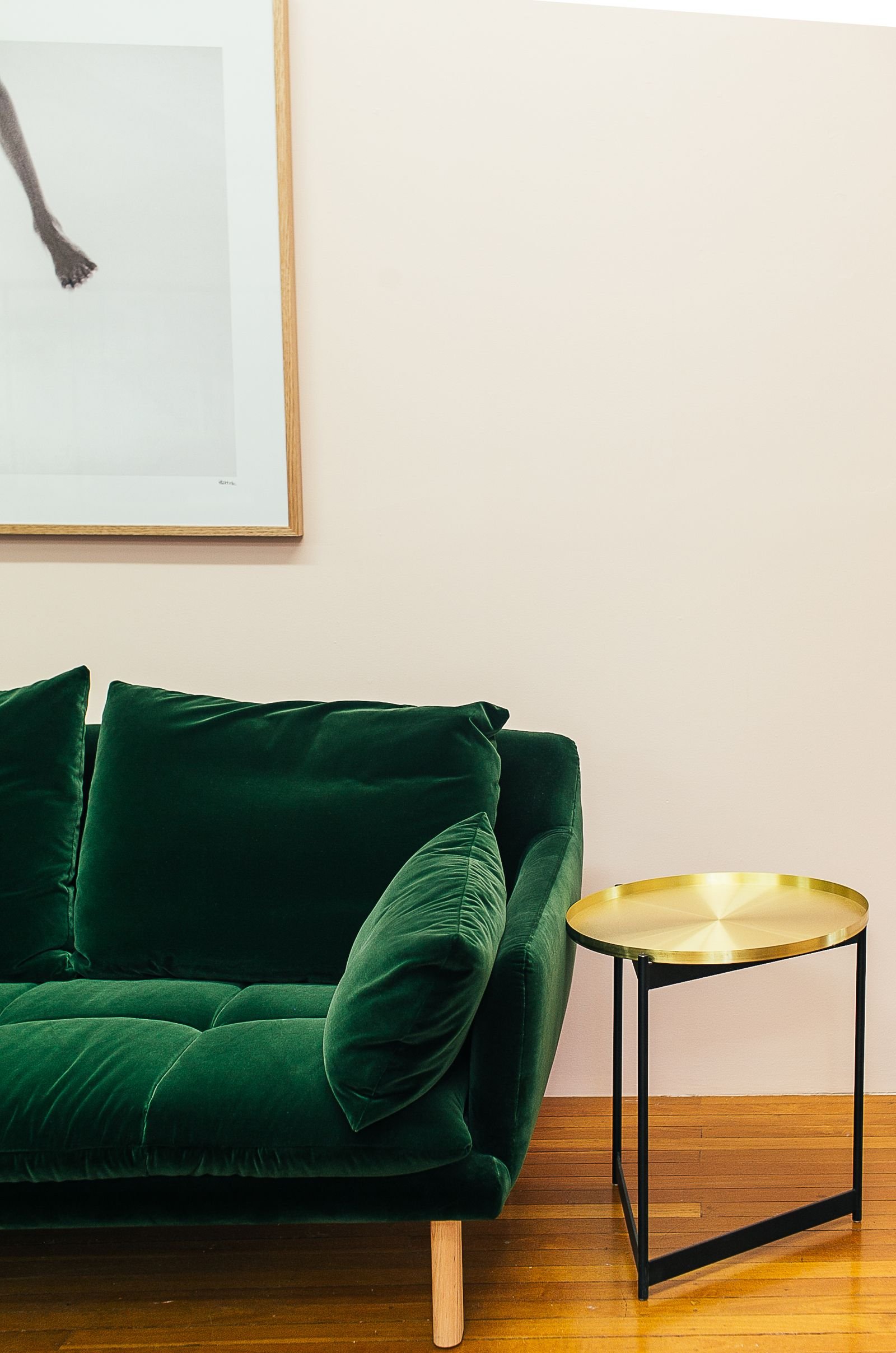
Emerald green, sapphire blue and ruby red add drama and a rich feel. Use them on one accent wall or on a statement piece such as an armchair or a velvet sofa. Against a neutral background, jewel tones look confident without taking over.
Soft Pastel Hues
Light pink, mint green and baby blue feel gentle and airy. Pastels work in bedrooms, nurseries and bathrooms, and they pair well with white or light wood for a clean, fresh look. To keep them modern, choose dusty or slightly gray versions rather than very sweet shades.
Popular Accent Colors
An accent color gives a room a focal point and some personality. It can change the mood quickly, and it is easy to replace later.
Deep Greens
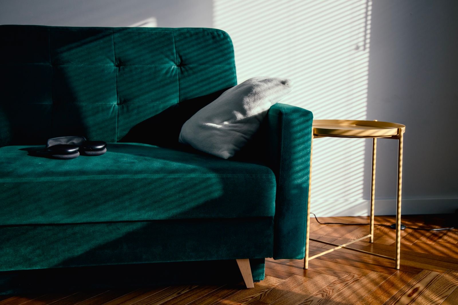
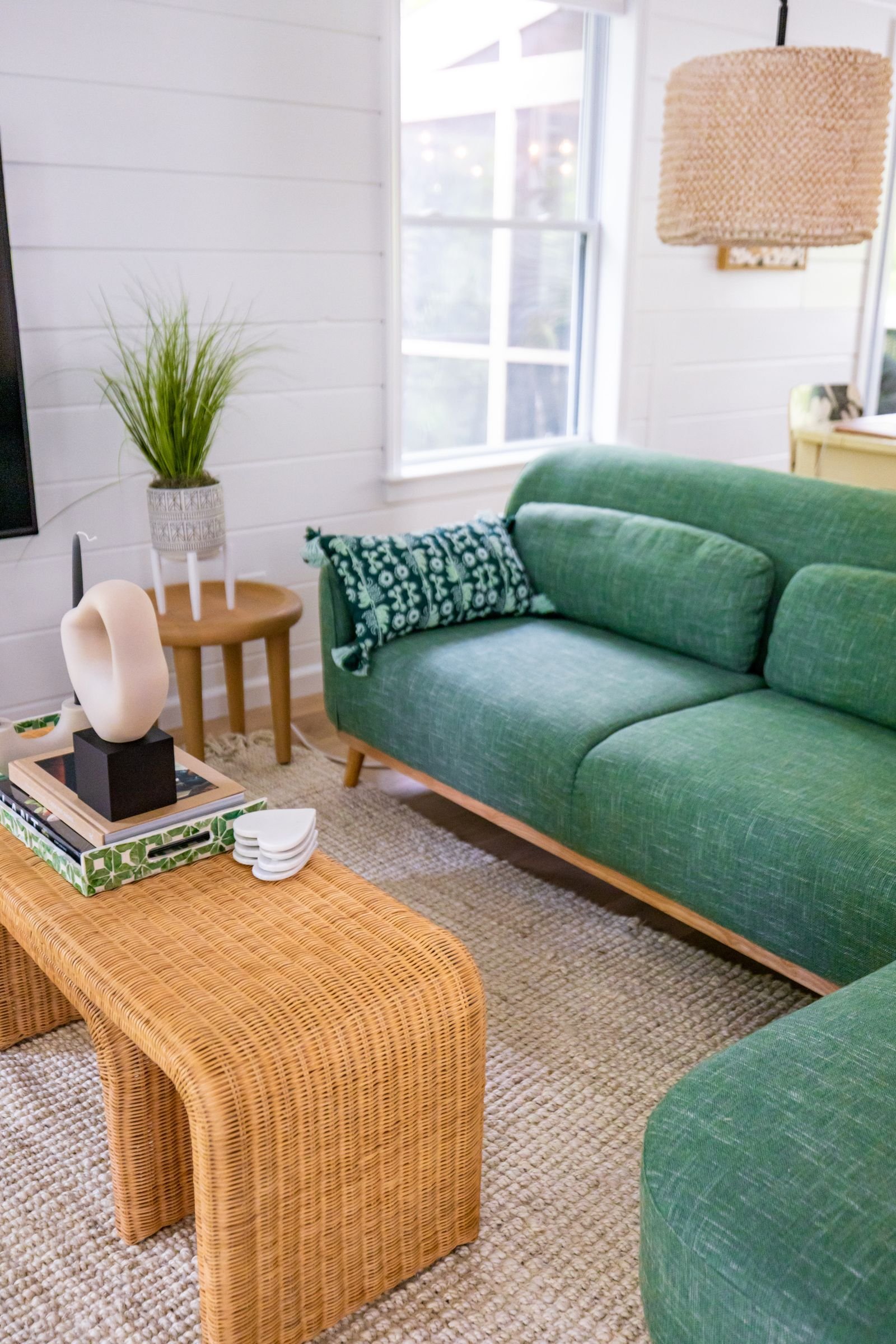
Deep green connects the room to nature and works with wood and neutral tones. Olive, moss and forest green all feel calm. Try it on cushions, a rug or one accent wall. For a bolder step, a green sofa makes a strong centerpiece.
Rich Blues
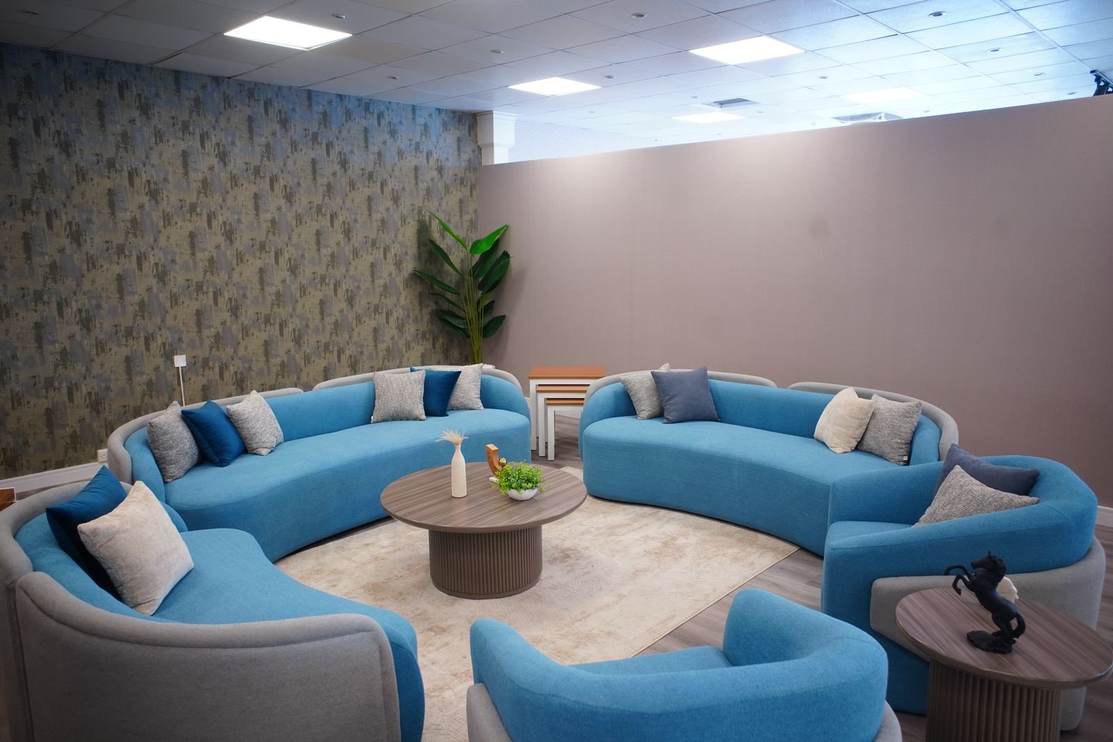
Navy, teal and deep blue add depth and elegance. They feel cool and settled, which suits living rooms and bedrooms. Pair them with white, gray or warm wood. Rich blue looks good on curtains, vases and artwork. For a full palette, see our blue and black home decor ideas.
Vibrant Reds
Red brings energy and warmth to places where people gather, such as a dining room or living room. A little goes a long way. Use it in small doses, such as a pair of pillows, a lamp or a vase, so it catches the eye without overwhelming the room.
Color Pairing Ideas
Good pairings make a room look balanced. These three methods are easy to follow, and they work for any style.
Complementary Combinations
Complementary colors sit opposite each other on the color wheel, such as blue with orange or green with red. They create strong contrast and energy. To keep the look easy on the eye, use one color as the main shade and the other as an accent.
Monochromatic Schemes
A monochromatic scheme uses one color in many shades, such as pale, medium and deep blue. It looks calm and unified, and it suits bedrooms and living rooms. Vary the textures so the room has depth. Our guide to monochromatic design goes into more detail.
Contrasting Accents
In a mostly white or gray room, a few bright items bring it to life. Yellow cushions or a red vase are enough. Keep the number of accent colors to two or three.
Incorporating Trends in Different Rooms
Each room has its own purpose, so each calls for a slightly different color approach.
Living Room Shades
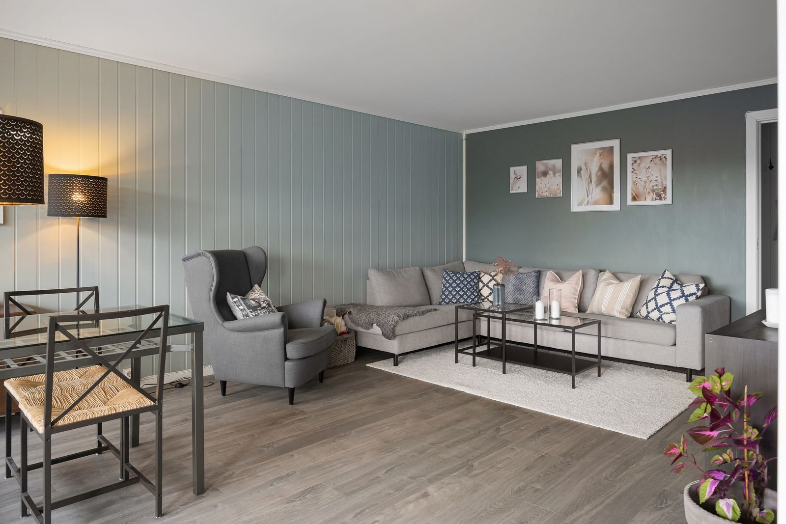
Soft greens and warm beige create a calm, welcoming living room. Deep blue adds elegance without feeling cold. Light gray walls make a good neutral base. Bring in new shades through accent pillows, throws and rugs.
Bedroom Colors
Bedrooms suit restful colors. Pale lavender, muted pink and warm taupe are soothing and pair well with white. Avoid very bright colors on the walls around the bed. Matte finishes help the room feel soft and smooth.
Kitchen and Dining Hues
Soft yellow, coral and sage green bring cheer to kitchens and dining rooms. White cabinets with a colorful backsplash keep the space fresh, and earthy terracotta adds warmth. Pick hues that feel welcoming for family and guests.
Warm Versus Cool Tones
Warm and cool tones shape the mood of a room, and both are in style. Choose by the feeling you want and the light the room gets.
Inviting Warm Hues
Terracotta, golden yellow and coral feel friendly and sociable. They suit living areas and kitchens, and they look natural next to wood and neutral fabrics.
Calming Cool Colors
Soft blue, gentle green and light gray feel restful and clean. They suit bedrooms and bathrooms, and they pair well with white, silver or glass. Cool shades can also make a small room feel more open.
Creating Balance With Color
Combine warm and cool tones for harmony, such as cool walls with warm wood and textiles. Light colors open up small spaces, and darker ones add depth and coziness.
Nature-Inspired Shades
Colors drawn from the outdoors fit almost any style and feel easy to live with.
Botanical Greens
Olive, moss and sage bring life to a room and look good with wood and neutral tones. Use them on an accent wall, a piece of furniture or a collection of plants and pots.
Ocean Blues
Teal, aqua and navy feel cool and clear. They work in modern and classic rooms alike, and they balance bright and neutral shades. Try them on walls, curtains and cushions.
Metallic Finishes
Metallics add shine and a touch of luxury, and they work with many colors.
Gold and Brass
Brushed or matte gold looks modern and soft. Polished brass suits classic and vintage rooms. Use these finishes on light fixtures, cabinet handles and furniture legs, and keep them to small accents.
Silver and Chrome
Silver and chrome feel sleek and reflect light, which suits kitchens, bathrooms and contemporary furniture. They pair well with blue, gray and white. Use them on lamps, mirrors and hardware.
How Lighting Affects Color
Light changes how every color looks, so always test paint in your own room before you commit.
Natural Light Effects
Daylight changes across the day. Morning light tends to be cooler, and afternoon light is warmer. A north-facing room usually looks cooler and grayer, and a south-facing room looks warmer. Dark colors can look lighter in a bright room and heavier in a dim one.
Artificial Lighting Influence
Warm bulbs add a yellow glow, and cool bulbs look whiter or bluer. LED and fluorescent lights can shift colors too. Look at the color temperature on the bulb box, and choose warm white for cozy rooms. Paint a large sample on the wall and look at it in the morning, in the afternoon and at night.
Sustainable and Eco-Friendly Color Options
More people want colors that look good and are made with less impact on the home and the environment.
Natural Pigments
Natural pigments come from plants, minerals and earth. They give soft, warm colors such as ochre, clay and muted green, and they blend well with wood and stone. Colors made from nature can shift slightly with the light, which adds charm.
Low-VOC Paints
VOCs are chemicals that evaporate from some paints and can affect indoor air. Low-VOC paints contain fewer of them. They come in many colors and finishes, usually dry with less smell and are a sensible choice for bedrooms and children’s rooms. Open the windows while you paint and while the paint dries.
Frequently Asked Questions
What Are the Top Color Trends for Home Decor Right Now?
Earthy tones such as terracotta and olive green are popular, along with soft pastels, muted blues and deep jewel accents. They create a calm, natural feel with a modern edge.
How Can I Use Bold Colors Without Overwhelming a Room?
Use bold colors as accents on pillows, rugs or artwork, and pair them with neutral backgrounds. This adds energy without making the room feel crowded.
Which Colors Work Best in Small Living Spaces?
Light neutrals such as beige, soft gray and off-white open up a small room. Pale pastels such as blush or light blue also work because they reflect light.
Are Warm or Cool Tones More Popular?
Both are popular. Warm tones such as mustard and burnt orange feel cozy, and cool tones such as soft blue are favored for calm bedrooms and bathrooms.
Which Colors Are Easiest to Sell With?
Neutral shades such as beige, soft gray and warm white appeal to a wide range of buyers and are easy to personalize.
Conclusion
New color trends give you plenty of ways to refresh a home. Warm earth tones and soft pastels create calm, and bold jewel shades add personality. Choose colors that make you feel relaxed, test them in your own light and start with small changes such as pillows, throws or one painted wall.

1 comment